Phillips Curve
Phillips Curve
Level: AS Levels, A Level, GCSE – Exam Boards: Edexcel, AQA, OCR, WJEC, IB, Eduqas – Economics Revision Notes
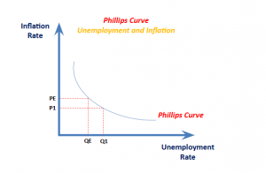
Philips Curve – Diagram
This suggests policy makers have a choice between prioritising inflation or unemployment. In the 1950s and 1960s, the analysis of the Philips Curve suggested that there was a trade-off and policy makers could use demand management (fiscal and monetary policy) in attempt to influence the rate of economic growth and inflation. For example, if unemployment was high and inflation low, policy makers could stimulate aggregate demand. This would help reduce unemployment, but cause higher rate of unemployment.
Short Run Phillips Curve
- This represents the trade off between unemployment and inflation
- As unemployment increases, inflation decreases
Long Run Phillips Curve
- This curve is L-shaped and can also be known as the vertical long-run Phillips Curve
- It shows unemployment at the Natural Rate of Unemployment, so there is no trade off between unemployment and inflation
- In the Long Run Phillips Curve, unemployment and inflation are unrelated
Implications of the Short Run Phillips Curve and the Long Run Phillips Curve
- In the short run, if the government tries to lower unemployment, they could be a rise in inflationary pressures on the price level
- Demand-deficient unemployment occurs in the short run, possibly discouraging the use of demand-side policies
- In the long run, unemployment rate and inflation are unrelated
- Supply side policies are likely to be used in the long run as there is no demand-deficient unemployment in the long run (see below for explanation)
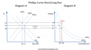
Phillips Curve Short/Long Run Explained
- The Long-Run Phillips Curve (LRPC) is always inelastic in the long run.
- An increase in aggregate demand (AD), which could be due to a fall in interest rates and so an increase in consumption, shifts the AD curve from AD1 to AD2 (diagram A).
- Output increases from Yfe to Y2 (diagram A), indicating demand-pull inflation.
- The equilibrium on the Phillips Curve shifts from point A to point B (diagram B), showing high unemployment and low inflation.
- Workers demand higher wages due to increased inflation, raising production costs for firms.
- The Short-Run Aggregate Supply (SRAS) curve shifts left from SRAS1 to SRAS2 (diagram B), returning output to Yfe.
- The Short-Run Phillips Curve (SRPC) shifts from SRPC1 to SRPC2 (diagram B).
- A new equilibrium at point C (diagram B) shows a return to the natural rate of unemployment and high inflation.
- This demonstrates that the LRPC always returns to the natural rate of unemployment where the inflation rate stabilises.
Quick Fire Quiz – Knowledge Check
1. What is represented by the Short-Run Phillips Curve (SRPC), and how does it illustrate the relationship between unemployment and inflation?
2. With the use of a diagram, explain the Short Run Phillips Curve (4 marks)
3. Explain the Long Run Phillips Curve (4 marks)
4. Explain the implications of the Short Run Phillips Curve and the Long Run Phillips Curve (6 marks)
Next Revision Topics:
- Economic Growth
- Unemployment & Employment
- Inflation
- Balance of Payments
- Aggregate Demand
- Conflicts Between Macroeconomic Objectives
A Level Economics Past Papers


